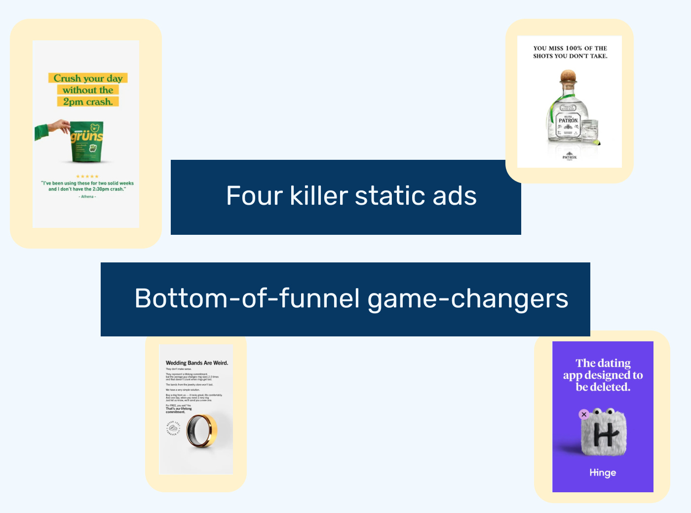
Four killer static ads
Bottom-of-funnel game-changers
Hi there,
When it comes to Meta ads, it’s easy to get caught up in video ads, but static ads have their time and place as well, especially at the bottom of the funnel.
Luckily, I recently crossed paths with someone who has a real knack for spotting great examples: Luke Nelmes, Head of Growth at Bigged.
It was a real-life version of a three-second hook that instantly piqued my curiosity: he was talking about filming himself eating insanely hot chicken wings… for LinkedIn.
We got chatting, and he ended up showing me full ad breakdowns he’d done for various DTC brands, including Heights, where I used to work.
Luke was kind enough to give Growth Waves an exclusive look at some of his favourite ads and explain why they work so well. So 100% credit to him for the content of this week’s newsletter.
He actually shared more examples than I could fit, so I’ve narrowed them down to the best ones for you.
Example 1: Grüns – Problem First, Proof Later
Why I included this example: I love JTBD-focused language, and I appreciate how it combines that with social proof.
The ad leans into problem-first messaging, positioning the product as the go-to solution for the dreaded afternoon slump. The bright, minimal layout ensures the viewer’s attention moves naturally from the pain point to the solution, and finally to proof.
Tactics to Steal
Lead with a relatable problem: Grab attention instantly by naming the specific pain point (the 2 pm crash).
Use a visual hierarchy: A bold headline at the top, the product in the centre, and a testimonial at the bottom, guiding the eye.
Keep visuals minimal: A single product image and a clean background stop scrolls without overwhelming the viewer.
Close with social proof: Authentic 5-star testimonials build trust and nudge action.
Optimise for vertical: Clear spacing and hierarchy make it perfect for Story and Reels formats.
Example 2: Hinge Ad – Purpose-Driven Messaging
Why I included this example: It’s the opposite of what every app wants, which makes it so scroll-stopping.
This bold, vertical static ad perfectly captures Hinge’s playful brand personality with a single, scroll-stopping visual: a fluffy, googly-eyed version of the Hinge app icon, complete with a tiny purple “X” that mimics a delete button.
The messaging is minimal but packs a punch, featuring the iconic line: “The dating app designed to be deleted.” This simple, purpose-driven statement instantly conveys Hinge’s promise: helping users find meaningful connections instead of keeping them stuck in endless swiping.
Tactics to Steal
Lead with a single hero visual: A playful, anthropomorphic product icon can instantly capture attention and humanise your brand.
Use purpose-driven copy: A counterintuitive tagline like “Designed to be deleted” builds trust by aligning with the customer’s ultimate goal.
Keep the layout minimal: One central visual and short copy make your ad digestible in seconds.
Balance humour with emotion: Light-hearted design softens serious messaging and strengthens emotional resonance.
Own your brand colour: A bold, signature background helps your ad stand out and reinforces recognition across feeds.
Example 3: Ridge – Challenging the Norm Ad
Why I included this example: It doesn’t look like a typical ad, but I feel like that’s why it works. Also, my husband and I had a lot of issues around getting the right fit for our wedding bands a few months ago, so I recognised the pain point.
The messaging is concise and disruptive, opening with the line “Wedding Bands Are Weird.” The ad immediately challenges a long-held tradition and then guides viewers through the pain points of typical bands, such as changing sizes, lost rings and poor durability.
It closes by presenting a clear, zero-risk solution with a lifetime replacement promise, free of charge.
Tactics to Steal
Lead with a norm-challenging hook: Begin with a bold statement that challenges tradition to capture immediate attention.
Humanise the pain point: Explain the problem in a casual, relatable way so the audience immediately connects.
Offer a zero-risk solution: Remove friction with a simple promise or guarantee that builds trust fast.
Use clean, product-first visuals: A minimalist design keeps the focus on the hero product and key credibility elements.
Reinforce confidence with bold copy: Short, direct lines emphasise reliability and long-term value.
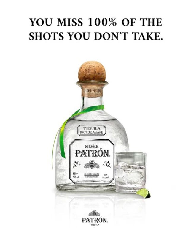
Example 4: Patrón – Product-Focused Hero Ad
Why I included this example: Tequila (especially margaritas) are my guilty pleasure.
The messaging is minimal yet memorable, featuring the headline “YOU MISS 100% OF THE SHOTS YOU DON’T TAKE.” The clever double meaning, blending life advice with tequila shots, adds humour and relatability, making the ad highly shareable and attention-grabbing.
Tactics to Steal
Humour That Mirrors Product Use: The headline directly connects to how the product is consumed (taking shots) while playing on a familiar cultural reference, making the ad witty and product-relevant.
Lifestyle Association Without People: By focusing on ritual elements like the bottle, glass, ice and lime, the ad evokes a social, celebratory moment without requiring models or elaborate staging.
Premium Through Restraint: High-end brands convey quality with minimal elements, allowing polish, reflection and clean composition to do the storytelling.
Cultural Borrowing for Memorability: Using a famous quote in a new context ensures instant recognition and creates a built-in shareability factor.
Implied Occasion Marketing: Subtle visual cues, such as the lime, ice and reflective surface, suggest when and how to enjoy the product, planting the idea in the consumer’s mind without overt instructions.
Recommendations
In every edition of Growth Waves, I also share a related resource to check out related to the week's topic.
It’s always inspiring to see what others are doing, but even more valuable is spotting patterns like Luke does. And it’s not just about chicken wings—he regularly shares ad breakdowns like these on LinkedIn:
He works for a new startup, Bigged, which is focused on helping startups create static ads at scale. Hence, there is a slight obsession with static ads—I'm not sure where the obsession with chicken wings originated.
Definitely give him a follow on LinkedIn, he’s new there, but if his analyses so far are anything to go by, great things are on their way!
Today’s newsletter was a little bit more tactical. I try to mix up the strategic advice with some tactical inspiration. If you enjoyed it and want more like this, definitely hit reply and let me know.
Until next week,
Daphne


Thanks Manuel, credit goes for sure to Luke for sharing the examples
Great examples, thank you very much dear Daphne!